Home Energy Monitoring System
We propose a residential electricity monitoring and feedback system that allows users to track their home energy usage, and encourages them to reduce consumption.
Our paper regarding this project was published at the CHI 2009 Conference, where our team placed fourth overall in the CHI Student Design Competition.
Download our CHI 2009 paper (1.2MB PDF)
See our paper in the ACM Digital Library
The Problem

There are 24 coal-fueled power plants in the state of Indiana, emitting 132 million tons of CO2 a year. If we reduced residential electricity consumption by a modest 10% we would prevent four million tons of CO2, 22,000 tons of sulfur dioxide, and 208 pounds of mercury from being released into the environment every year.
Climate change is one of the most wicked problems facing humanity today, and the release of CO2 into the atmosphere is one of the largest contributors to global warming. Electricity production, especially through the use of coal-fired power plants, is a major source of emissions, accounting for 38% of all CO2 released into the atmosphere each year in the U.S.
In addition to CO2, power plants emit other pollutants that affect not only the climate but also water purity and physical health. In the U.S., electricity production accounts for 69% of sulfur dioxide, 36% of mercury and 22% of nitrogen dioxide released into the environment each year.
There are 38 public utility power plants in Indiana. 24 of these, including the ten largest power plants in the state, are fueled by coal. Indiana generates 95% of its electricity with coal, while the rest of the country averages just under 49 percent.
In 2006, residential customers in Indiana used over 32 million MWh of electricity, totaling more than $2.6 billion. Reducing our consumption by 10% would result in an annual savings of over $265 million, or $100 for every household in the state.
Existing Solutions
We surveyed a number of home energy devices available on the market or under development and discovered at least twenty solutions designed for managing or monitoring home electricity usage. Many of these solutions, such as Energy, Inc’s TED-1000, Blue Line Innovations’ PowerCost Monitor, or DIY KYOTO’s Wattson, are devices that passively display information, including the number of kilowatt hours your home has used or how many dollars you’ve spent per month. Visualizing monetary cost has a limited effect, however, primarily influencing the behavior of the person directly responsible for paying the electricity bill.
Some of the devices, such as Energy Optimizers Ltd’s Ploggs or INSTEON’s SmartLinc, don’t address energy usage directly, and rather are intended for controlling and automating household appliances. The most exciting products, such as the Agilewaves Resources Monitor and the Tendril Residential Energy Ecosystem, offer detailed historical graphs and web-based access, but are not yet commercially available.
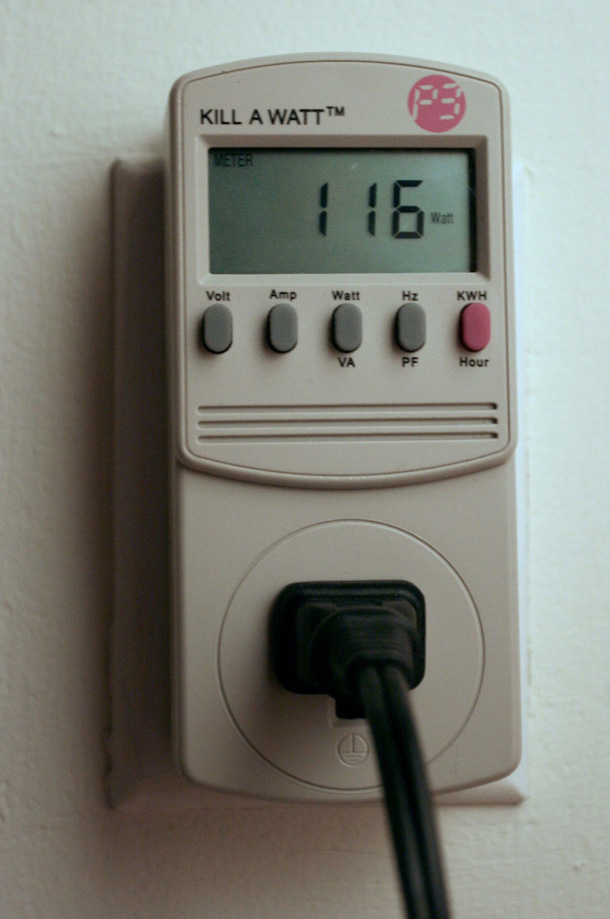
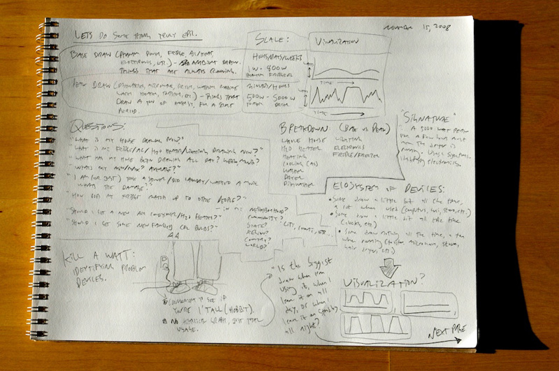
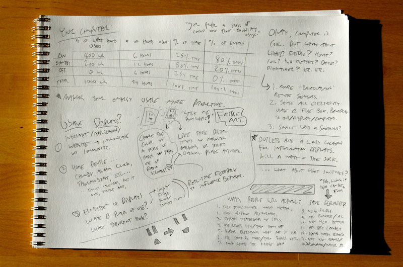
To further our understanding of the energy consumption problem, we each used a Kill A Watt energy usage monitor to measure the electronic devices in our own homes. We recorded the levels of wattage drawn by these devices so we could recognize and compare how much electricity different devices consumed. The Kill A Watt is a playful tool and we quickly realized how easy it was to overlook the continuous trickle of electricity consumed by devices that use standby power. This exercise enhanced our awareness of standby power consumption and informed the design of our prototype.
Our Solution
We propose an electricity usage display that would allow homeowners to track their home energy consumption over time, and encourage them to reduce their energy use.

Taking the best ideas from these products, we decided that we must design something that will be visually compelling, interactive, engaging, and mobile. We propose an electricity usage display that will allow homeowners to track their home energy consumption over time and encourage them to reduce their energy use. Our solution will be an application for the iPhone that communicates with your home and allows you to view, compare and analyze your electricity usage over time.
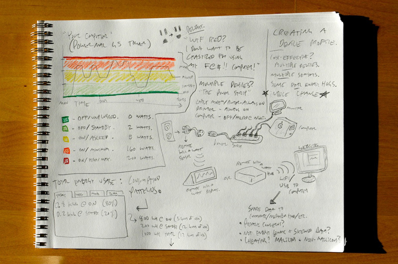
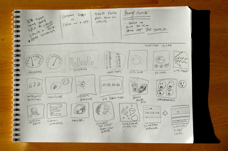
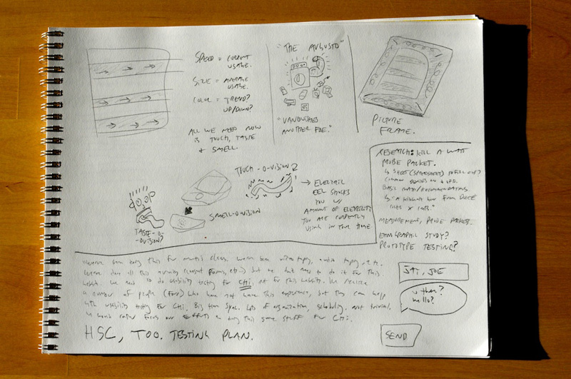
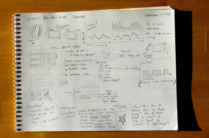
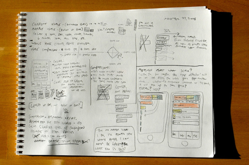
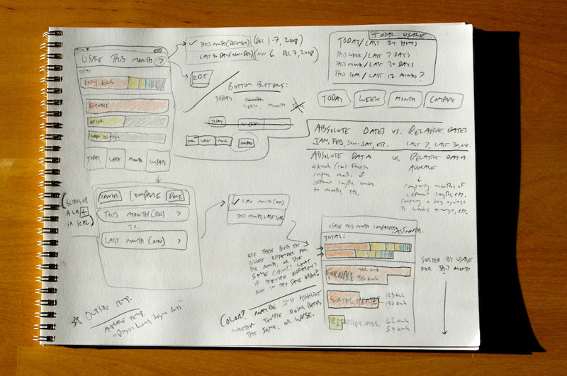
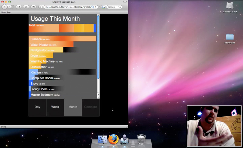
In the process of zeroing in on our visualization strategy we furiously sketched and generated numerous concepts. We brainstormed on different ways to represent this graphical element, and eventually zeroed in on a series of colored bars that would animate to represent current usage. We considered building this out as a paper prototype, but given the animation element we decided against this, in favor of building a modestly interactive website prototype. This let us communicate some of the interactive elements of the design, in addition to the bar animations.
Collecting the data for visualization.
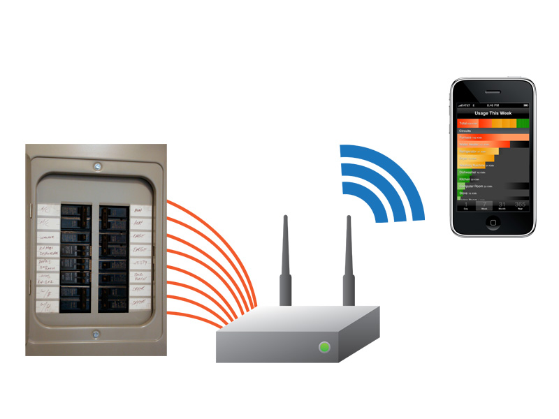
In order to gather the electricity usage data necessary to generate compelling visualizations, we focused on the home’s circuit breaker box. Unlike many energy usage devices on the market that only sense the usage of the entire home, our system breaks down its data collection by individual circuit, so it can give its users a fine-grained understanding of where their electricity is going. There will be cases, such as the kitchen, where people have multiple appliances and devices plugged into the same circuit. However, this setup still allows us to call out the biggest offenders, like air conditioners, furnaces and refrigerators, which consume so much electricity they must be on their own circuit.
Attached to each circuit will be a small clamp or wire, that measures the amount of electricity passing through the circuit. This is a routine means of sensing the amount of current flowing through a wire, by wrapping another wire around it and sensing the electromagnetic field being generated by the electrical flow. These wires are then connected to a data collection hub. This device would be a small box that can hang on the wall next to the breaker box, and would record and store the electricity usage for each individual circuit.
This box wouldn’t have a display of its own, but would broadcast a wireless signal so you could access its configuration and visualization screens over your home wireless network using an application on your iPhone or iPod Touch. We believe that the key to encouraging people to engage with their electricity usage information is to make it truly mobile, available anywhere in the house at any time. Indeed, this solution does require that people have a home wireless network as well as an iPod Touch, but we decided it would be best to leverage pre-existing multi-purpose technologies, rather than require that people make a significant investment in devices that only report on energy usage. Plus, leveraging the interactive innovations of the iPhone or iPod Touch will allow us to make a far more compelling experience.
Our Prototype
See our Interactive Prototype
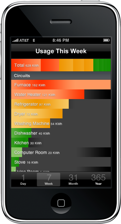
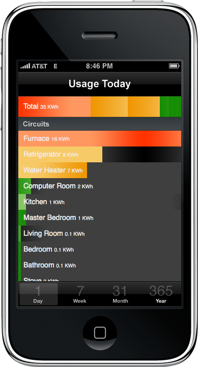
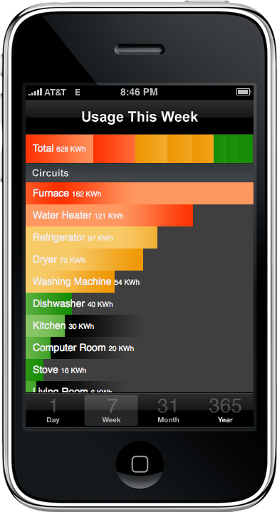
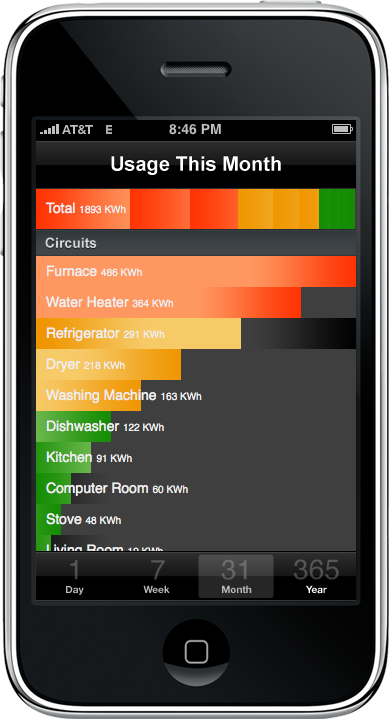
The main screen of our application shows each individual circuit from the breaker box, and the length of the bar represents how much electricity that particular room, device or appliance has used during a given timeframe. The bars are sorted by usage, so the biggest offenders are always on the top. Each bar is color-coded depending on how much electricity it has consumed. The bar at the top represents the total household usage, with a shaded bar for each device representing its percentage of the total. We hope that by regularly communicating these home energy usage patterns, our users will take meaningful steps towards reducing their electricity consumption.
The gradient animates when a device is currently drawing electricity, at a speed determined by the rate at which it is consuming energy. We hope that through these animations, people will find it easier to wander around their house, identify items that are consuming electricity, and decide whether or not it’s worth having that device turned on. This would be useful when preparing to leave for work for the day, and especially useful when leaving on vacation.
User Evaluation
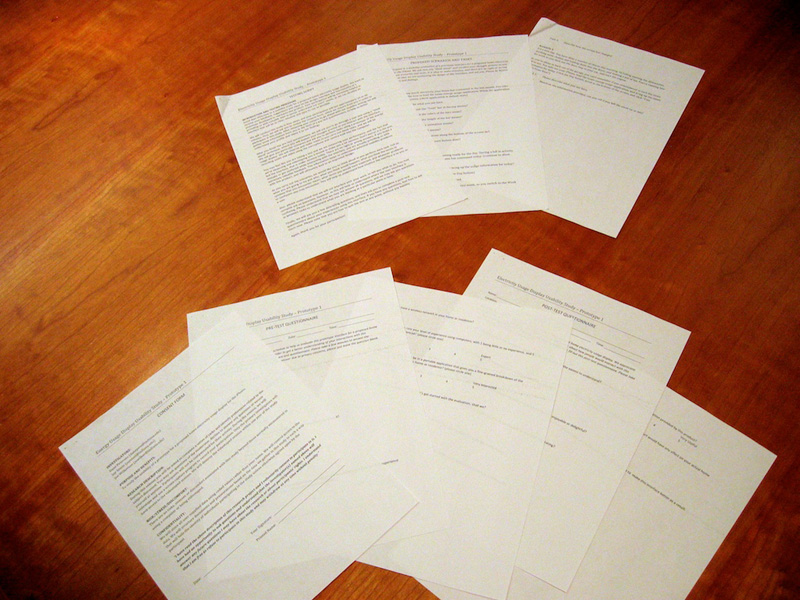
We created a series of prototypes for the energy visualization display using XHTML, CSS and JavaScript, and conducted a series of usability studies to identify any problems and to gather peoples’ response to the interface. To record these testing sessions we used Silverback, an application for OS X that allows you to record the action on the screen, as well as record audio and video to gauge the user’s facial and verbal responses.
To inform future iterations of our prototype, we conducted a full-scale pilot usability study on three participants. We also used this opportunity to test our pre-evaluation and post-evaluation questionnaires in order to refine the questions for future studies. The participants successfully completed most tasks, and we learned that they found the gradient animation analogous to a standard outdoor electricity meter. We discovered that the total bar at the top was confusing to users, and that our initial color scheme was misleading. A few users misinterpreted the warmer-colored bars as representing heat output, not electricity usage.
The Future
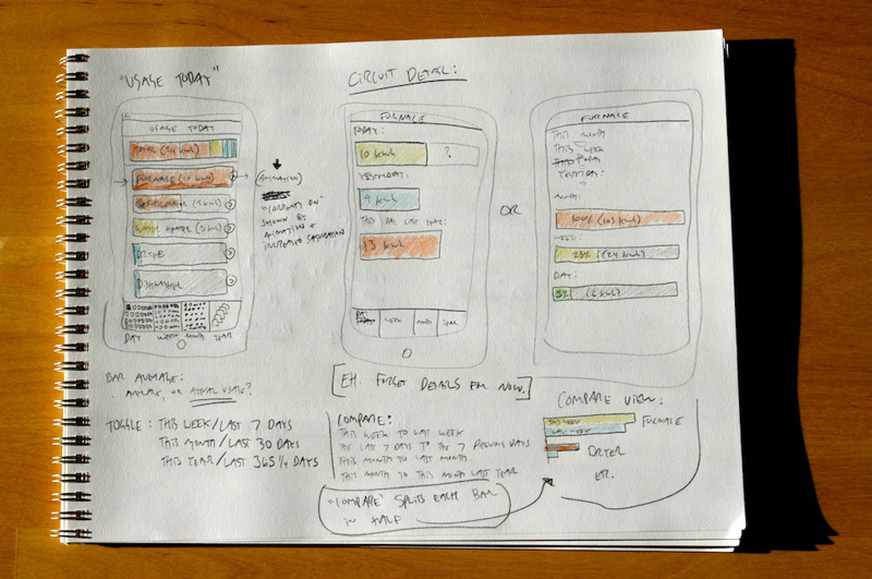
We’ve entertained a number of compelling ideas that we would like to examine further, as we continue designing this system. Based on our usability testing, we know that people would find tremendous value in being able to look up their historical usage records, access previous days, weeks and months. We would like to offer a detailed appliance view, that would give you the history not just of your entire household usage, but on that specific device. Also, our usability participants told us that they would like to be able to compare days to previous days, weeks to weeks, and months to months.
Additionally, we would like to break this information out of the iPhone or iPod Touch, and make it available through an application or website that you could access on your home computer. We have considered allowing remote web access through a secured interface, so you could access all your home electricity usage from anywhere in the world, at any time.
From a sensing point of view we are considering some sort of ecosystem of remote sensing plugs, that you could deploy throughout your home to get a finer-grained understanding of how different devices throughout your home are using electricity, even if they aren’t on their own independent circuit. These plugs would communicate wirelessly with the data collection hub, and when combined with remote web access, could enable you to control your home appliances from anywhere. This would have significant security implications that we would want to carefully consider, but it is a particularly exciting idea.
We are also interested in some sort of community view, where you could see how you stack up in usage compared to other households in your city, state or country. There are serious privacy concerns for a system such as this, however, which we want to make sure we completely understand before moving forward.