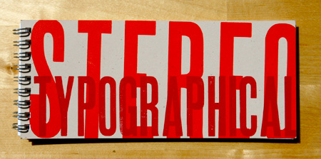
Typography Cliché Letterpress Book
As part of a class project to familiarize ourselves with traditional letterpress machinery, we printed a book of typography clichés in the type shop at Indiana University.
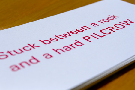
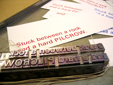
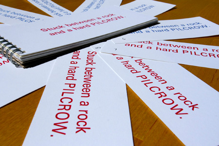
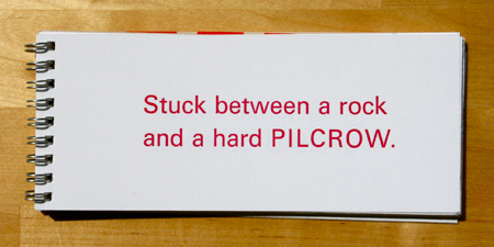
I set my own cliché, “Stuck between a rock and a hard pilcrow,” in 30-point Univers 55 Roman, a sans-serif typeface designed by Adrian Frutiger in 1954. Handsetting type using these age-old techniques has made me sensitive to the most minute details of typography, and has helped lend a historic grounding to my design perspective.
Strings of all-capital letters need to be carefully spaced in order to feel properly balanced. The gaping O in PILCROW cuts a perceptual hole the word, presenting a formidable spacing challenge that required at least ten printed revisions before achieving a satisfactorily rhythmic harmony.
I adjusted the kerning between these letters by hand, using 1-point and ½-point spaces made of brass and copper.
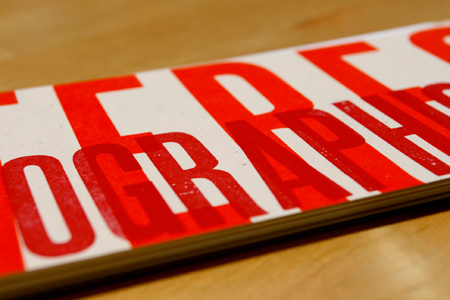
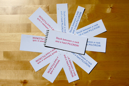
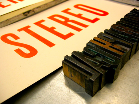
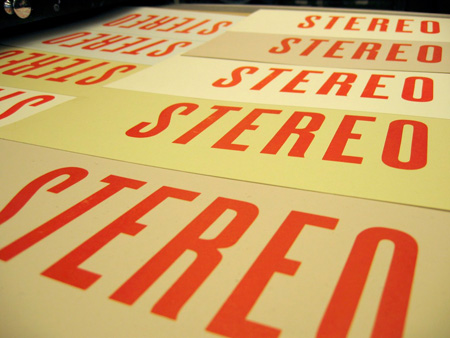
We created a run of 30 prints, one for each member of the class to bind into their own type book. Our small team also designed and printed our own book cover, a two-color layered design set with wood type.
