Smart.fm iPhone Experience Concepts
At Adaptive Path I worked with the Smart.fm team, helping Tokyo-based Cerego bring their online learning experience to an original app for the iPhone. I engaged in extensive concept generation and ideation, exploring metaphors to inform the design direction of the gaming experience for their new iPhone app.
The place you go to learn.
Smart.fm is an online learning community dedicated to helping people memorize all sorts of world knowledge, from Japanese words to state capitals to European birds. The bulk of learning currently happens on their website, where visitors can play a series of fast-paced learning games, akin to flash cards on steroids.
In bringing this experience to the iPhone, we wanted to preserve the fun and playful nature of these games, while adapting them to this unique and mobile platform.
You can take it with you.
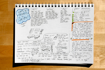
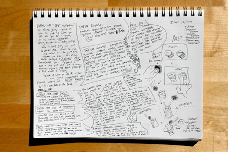
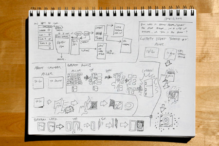
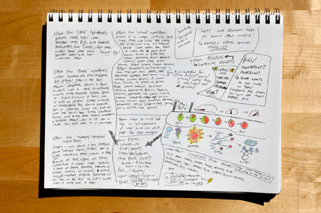
I generated numerous sketches and concepts for ways we could represent the timed, multiple-choice nature of Smart.fm’s mobile learning game in a richly experiential manner.
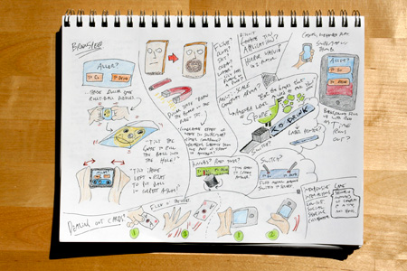
From dollar store games to Wooly Willy, from scratch-off lottery tickets to Pogs, nothing was off-limits during this highly generative process. I was deeply interested in exploring the materiality of the game-space, and I imagined ways to introduce tangibility to the game through unique interactions.
Explaining myself in five minutes or more.
In this five-minute video I present a brief walk through my sketchbook, discussing my preliminary explorations in finding a compelling metaphor for the Smart.fm iPhone app.
Based on feedback from my initial rounds of sketching, I brought some of my explorations into a bit more detail, depicting potential directions for the learning game. “Sore” is the Japanese word for “that one,” and I oriented these sketches around a screen where the user is trying to learn this word, and must select its correct response from a series of choices. I discuss these detailed concept sketches in this video.
The detailed concept sketches. In, well, detail.
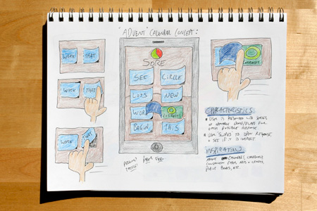
In the Advent Calendar concept, the user would select a response by swiping a “cardboard” flap, which would flip open to reveal the answer.
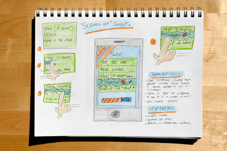
In the Scratch-Off concept, the user would “scratch” off a desired response to see if it is right or wrong. This concept could possibly allow the user to “peek” at a response before choosing it.
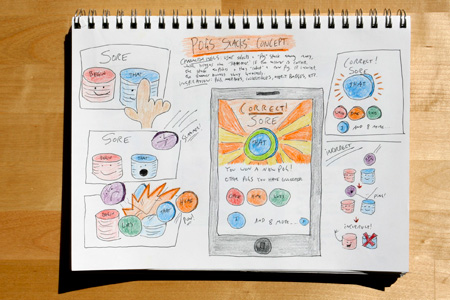
The Pogs “Stacks” concept introduces the idea of allowing users to “collect” correct answers. When the user chooses a correct response, that Pog would be added to the user’s collection.
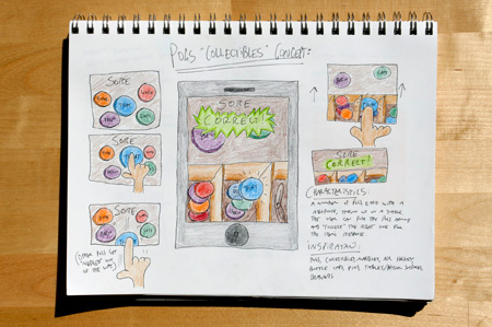
The Pogs “Collectibles” concept presents the user with a tabletop covered in possible “Pog” responses. The user selects a desired response, and drags it into a drawer where they are collecting correct answers.
Honing in on a design direction.
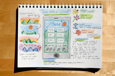
In the “Your World” concept, the game-space is superimposed on a landscape that changes as the user progresses through the game. Correct answers populate the world with leaves, flowers or lightning bugs, time is indicated through a rising and setting sun, and the seasons change at certain milestones in the game.
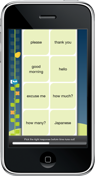
Ultimately, the “Your World” concept set the stage for the final design direction of the Smart.fm iPhone app. Alexa distilled this idea into a playful landscape, populated by an owl who hops up a vine as the player progress through the game.

Aching for more juicy details?
The folks at Cerego are super cool, and they gave us permission to freely and openly blog about our work on their Smart.fm iPhone app while we were in the process of crafting it. Check out An Owl’s Life on the Adaptive Path weblog for details on our entire design process. Imagining Possible Worlds is my contribution to the Smart.fm story, where I go into further detail about my concept generation process.
