Responsive UI for Predix App Hub
While working at GE Digital I built the responsive UI for App Hub, an architecture that lets developers build and deliver large web applications as a series of discrete microapps.
The Challenge

Predix APM is GE Digital’s flagship asset performance management product that helps customers remotely monitor and optimize their industrial equipment.
As the capabilities of Predix APM grew, from a focused product for the energy sector to a suite of solutions for any company that manages industrial assets, the complexity of the front-end code grew in kind. Dozens of UI engineers on the Predix APM team found themselves building distinct application modules, each with their own unique requirements and dependencies.
Due to architectural constraints, the entire Predix APM front-end team was required to commit their code to a single repository, and build and release the UI as a single monolithic web app. This led to frustration across teams as dependencies between modules would often conflict, and a disappointing experience for end users as loading the entire application suite at once led to poor performance and stability.
The Solution
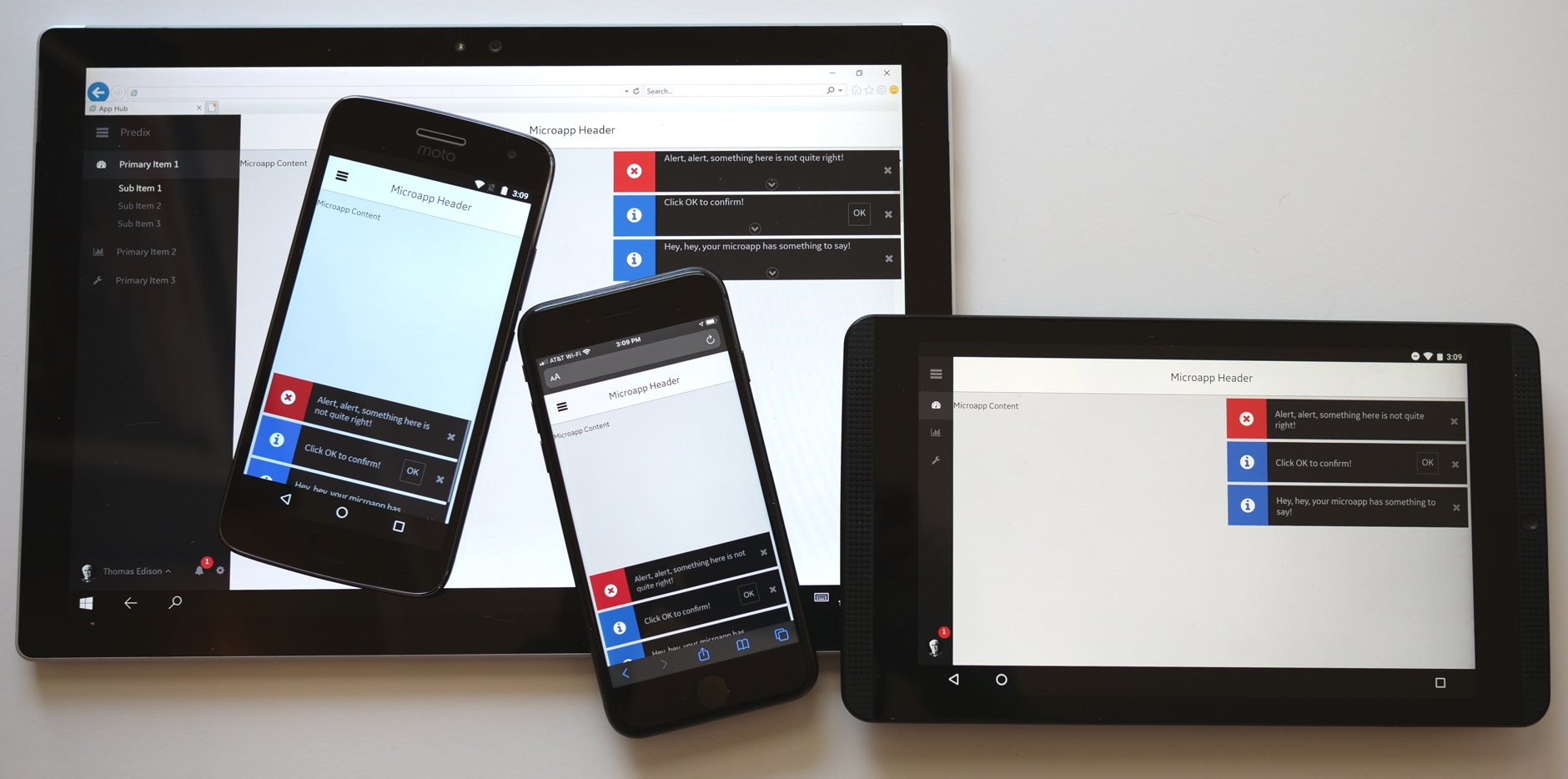
I joined a small team where I helped build GE Digital’s App Hub architecture, which empowers engineering teams to break their large monolithic web apps into smaller “microapps” that are seamlessly combined at runtime into a single unified experience for the end user.
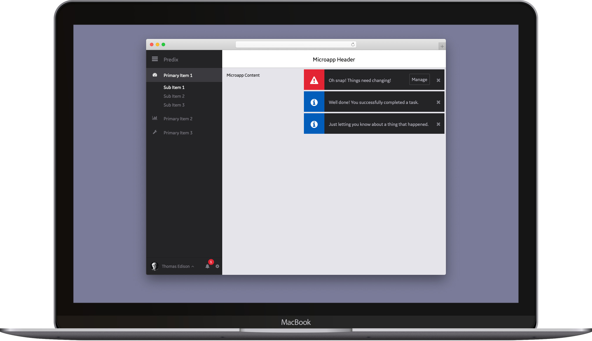
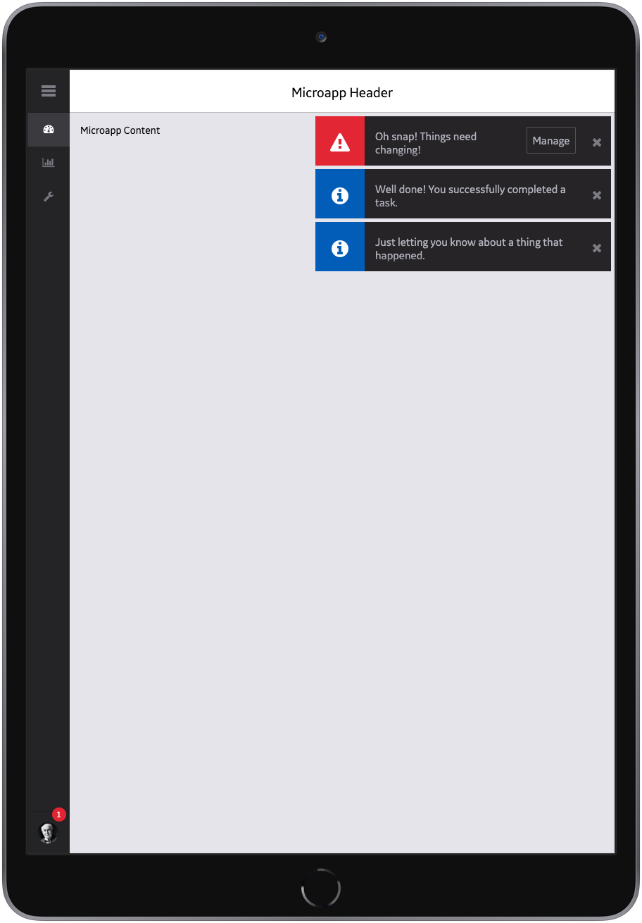
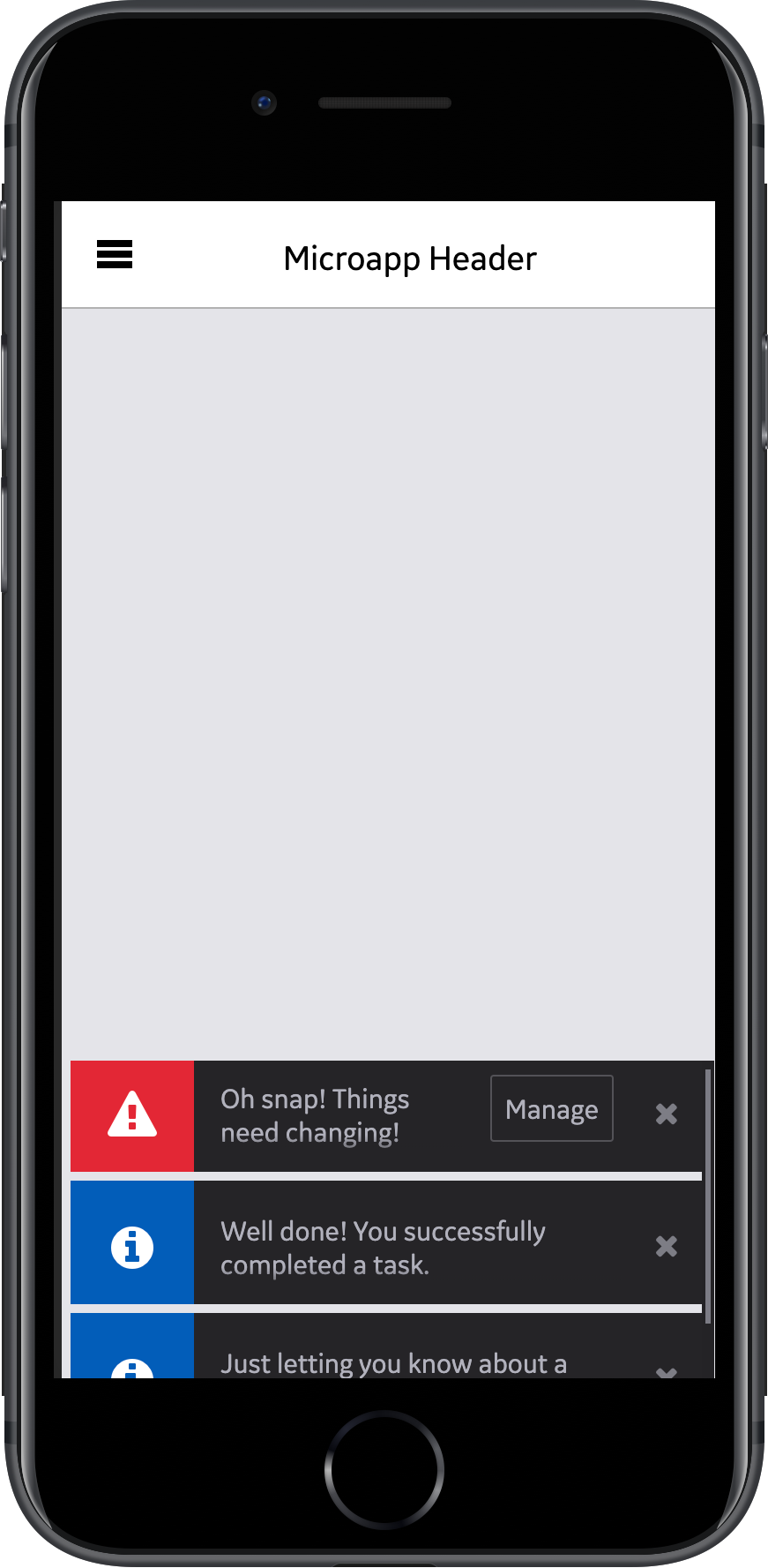
Each microapp is a standalone web application, complete with its own dependencies and build pipeline, which is then “proxied” into the App Hub via a lightweight Express app that handles authentication, authorization and templating. My core responsibility on the App Hub team was building the layout UI that displays all global application elements, including navigation and notifications, and wraps around each and every microapp.
I worked closely with the Predix APM UX team to ensure not only that the App Hub UI was a pixel-perfect representation of their designs, but that its interactions reflected their intent as well. The UI is fully responsive across mobile, tablet and desktop breakpoints, and I followed a mobile-first methodology for organizing classes, styles and behaviors.
Constrained by known unknowns.
My code for the App Hub UI was deeply informed by unknowns. We deliberately built the architecture so that just about anything at all could be a microapp and rendered within the App Hub, from a static HTML page to an Angular app, to a jQuery site, to a Predix-themed version of Bootstrap, to an app built entirely with Predix UI Polymer components.
Given these unknowns, I had to tread carefully with my CSS and JavaScript to ensure it wouldn’t conflict with any definitions that might be in a microapp. Likewise, my code had to be robust enough to withstand unexpected global behaviors that might spill out of a microapp, while leaving space to be overridden when a microapp developer really really means what their code is saying.
Mobile-first Sass, with a class syntax to match.
I authored the App Hub UI styles in Sass, taking care to implement reasonable defaults while avoiding global definitions that might lead to unexpected behavior within a microapp. I built the layout in a mobile-first, responsive fashion, using a namespace prefix to avoid style collisions, ITCSS to rationalize source order, and BEM syntax to clearly articulate relationships between elements.
Writing “mobile-first” styles means that all the base styles and classes of the App Hub UI are applied universally, at the narrowest breakpoint. Any unique layouts or behaviors at wider breakpoints are layered on top of those base styles. Rather than implicitly altering the style of a class based on breakpoint, I embraced immutability and implemented these additional styles as explicit classes for their respective elements, extending the “modifier” piece of “block, element, modifier” with a “responsive modifier” syntax.
For example, a drawer that’s hidden (by default) on mobile, narrow on tablet, and wide on desktop might look like <nav class="drawer drawer--narrow@md drawer--wide@lg">. While verbose, this syntax allows other developers to quickly understand how the App Hub UI behaves across multiple breakpoints simply by reviewing the HTML markup.
In the end, a bevvy of design components underlie the seemingly straightforward App Hub layout, including a fully responsive drawer, microapp navigation and sub-navigation, item badges, loading indicators, menus for user and application settings, alert toasts, and a notification center for managing persistent alerts. The App Hub UI even includes a “flipped” layout that supports right-to-left languages, which is elegantly implemented by changing a simple configuration variable in Sass.
JavaScriptin’ like it’s 1999.
In terms of JavaScript, I worked pretty close to the metal due to the constraints and variability inherent in wrapping microapps. The App Hub code can’t use any external JavaScript dependencies, for example, because those dependencies might conflict with a dependency (or even a specific version of a dependency) in a microapp. Teams across GE Digital managed their application dependencies in a variety of ways, so NPM, Bower, JSPM and plain ol’ /lib folders and script tags were all within the realm of possibility. Different teams were writing different flavors of JavaScript using different transpilers, bundlers and build pipelines, so I had to be careful not to run afoul of those as well.
Finally, since support for Internet Explorer 11 was a requirement, I ultimately found myself writing the App Hub UI in plain vanilla ES5 JavaScript with no external libraries or transpilers. This turned out to be fairly straightforward when the JavaScript was simply for managing popover menus, responsive behavior and layout state, but it got more complex as I implemented a global event-based toast and notification system. Fortunately, a robust linting strategy kept me and my code honest even when the going got toughest.
Testing the units, the end-to-ends, the manuals…
To keep my nose clean while building, updating and refactoring the App Hub UI, I wrote unit tests with Mocha and Chai, and end-to-end tests with Protractor and Selenium. While Nightwatch or Cypress are more suitable options for today’s end-to-end testing, it’s a little-known fact that back in the day you could use Protractor to test web apps written in any technology, not just Angular.
I did extensive manual testing on the App Hub UI as well, regularly mashing it by hand on actual macOS, Windows, Windows Touch, iPhone, iPad, Android phone and Android tablet hardware.
Writing it down to remember it now. And later.
I took pains to carefully document the App Hub UI, creating a microapp in its own right that contains numerous pages of usage examples, and details all the available states of individual components. I also commented my Sass and JavaScript code so that in addition to hand-crafted documentation, we could auto-generate documentation using SassDoc and JSDoc as well.
App Hub + APM FTW!
In July 2016, the Predix APM team officially migrated their application to our App Hub architecture, finished splitting their monolith into microapps, and launched the refactored version of Predix APM to production. Over the following months, numerous other teams at GE Digital would adopt the App Hub architecture and begin building microapps as well.
Project Responsibilities
Strategy, Architecture, Development, Testing, Documentation
Project Technologies
HTML, CSS, JavaScript, Sass, Gulp, Node.js, Express
Project Team
Hiren Adesara
Pete Butler
Minh Dang
Victor Hsu
Dane Petersen
Ben Sykes
Project Timeline
March – December 2016