Letterform Combinations
In my typography course we explored figure/ground relationships by combining two letterforms into a single visual unit. This project helped fine-tune my appreciation for the variety of subtle differences that can be found in various typefaces.

The Process

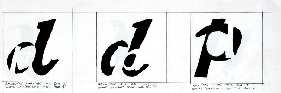
I started the exercise by generating numerous one-inch sketches of different letterform combinations. Limiting myself to the letters ‘d’ and ‘p’ forced me to work within tight constraints, while offering the promise of a personalized logotype should I generate a successful design.

I chose three letterforms to expand into three-inch sketches, which were critiqued by the professor as well as other members of the class.

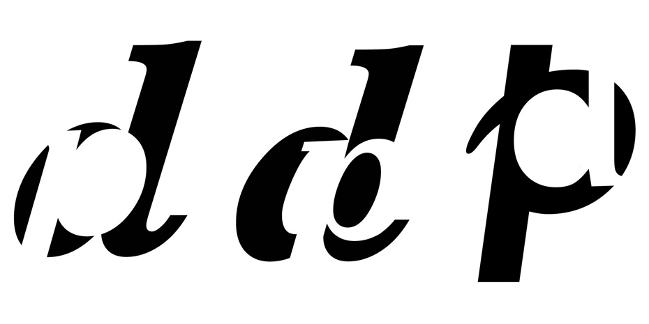
In an effort to evaluate the precision of my previous sketches, I began interacting with the letterforms in Photoshop. Despite their accuracy, I came away largely dissatisfied with their compositional qualities.

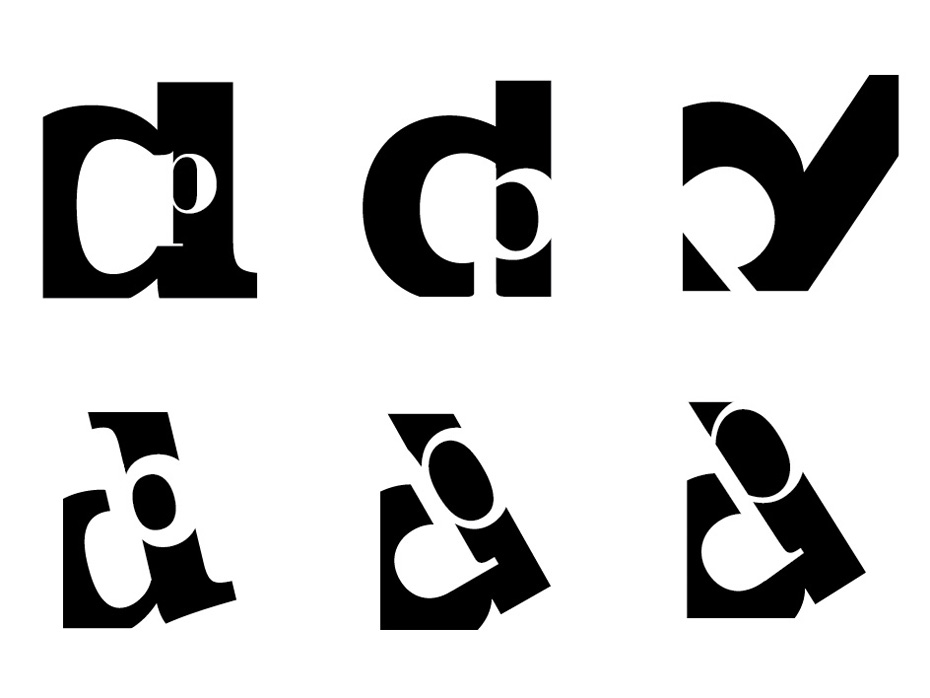
My designs received fairly scathing critiques in class. My fellow designers urged me to be more adventurous in my designs, and to experiment with rotation and canvas boundaries. I fired up Illustrator and began reworking a few sketches that I had generated all the way back at step one. By pushing scale and intersecting the canvas I was able to generate more interesting designs.
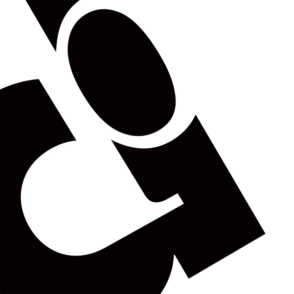
 The final letterform combination features a lowercase ‘p’ in Century Schoolbook inscribed inside a lowercase ‘d’ in Futura. The descender of the ‘p’ and the counter of the ‘d’ incidentally form a second lowercase ‘d’ that is inscribed inside the Futura letterform.