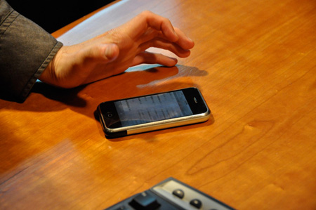
Weight Watchers Fast Food Advisor
We aim to help our users make good, healthy eating choices when they are at their most vulnerable, and when they are most likely to give into temptation: when they are eating out.
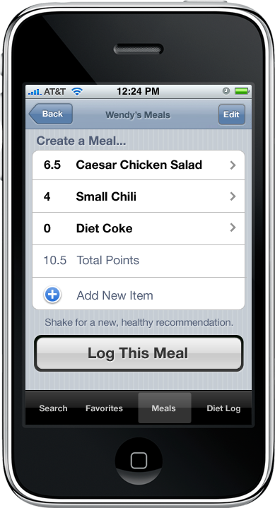
The iPhone is the best-selling mobile phone in the United States. Weight Watchers Online has more than 600,000 subscribers, and is experiencing rapid growth. Our team was asked to develop an iPhone application for Weight Watchers that their members would find delightfully useful, and would encourage more people to become Weight Watchers members and iPhone owners alike.
Our visit to Weight Watchers.
As part of our primary research to inform our design argument, we attended the weekly meeting of a local Weight Watchers chapter. The issue of temptation was a big topic throughout this meeting, and the members shared a number of creative ideas that they used to encourage healthy eating and snacking at the home. However, one of the members brought up the issue of eating out for lunch, and shared how difficult it was for her to resist the big glossy pictures on the menu board at her favorite fast food restaurant. With no nutritional information, she felt it was very difficult to resist temptation and make a healthy choice.
One of the other members suggested a website called Dottie’s Weight Loss Zone, which has compiled the nutritional information and Weight Watchers Points values for a dizzying variety of chain restaurants and fast food joints. Upon hearing about this website, a number of members scrambled to take out notebooks and scraps of paper so they could write it down. It was obvious that the information provided by this website was perceived as a veritable gold mine to inform healthy eating!
While conducting secondary research, we came across a number of studies showing that over the last 25 years Americans have been eating out more often, and eating fewer meals at home. Americans spent 26% of their food dollars on meals prepared outside the home in 1970, but by 2002 that number had increased to 46%. Almost half of American adults eat out on any given day, and most restaurants do not make nutritional information readily available to their customers.
Helping you stick to the program.
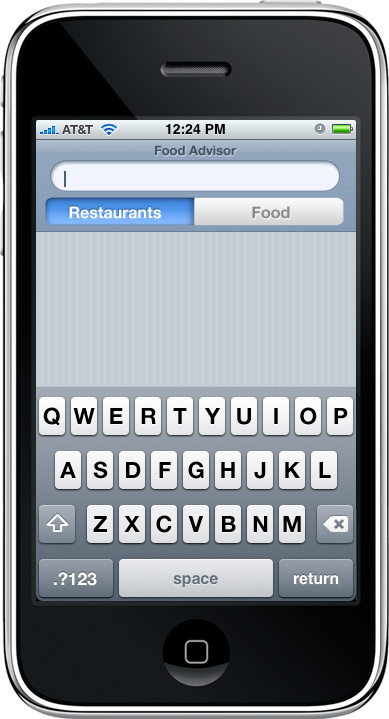
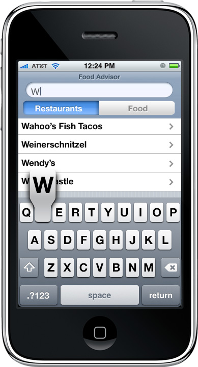
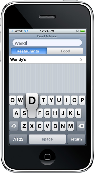
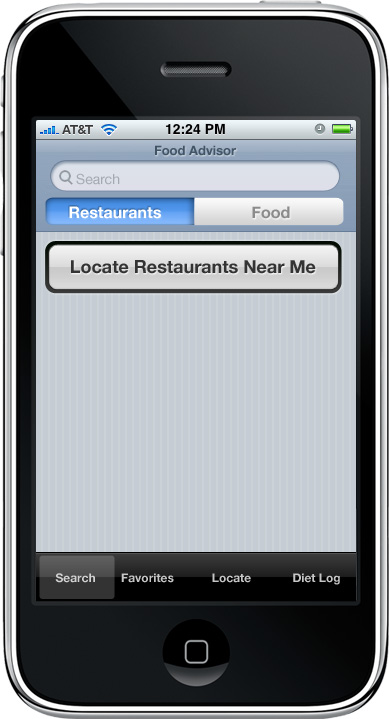
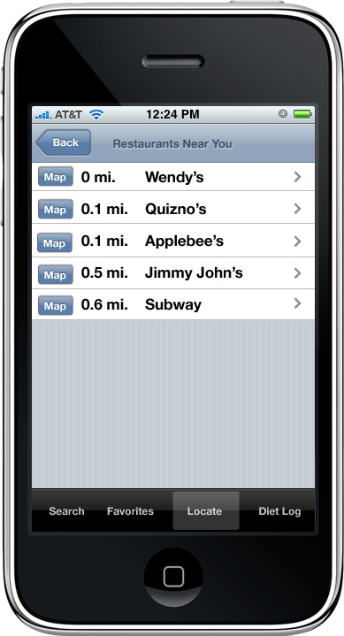
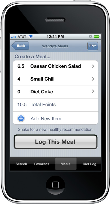
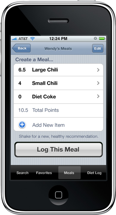
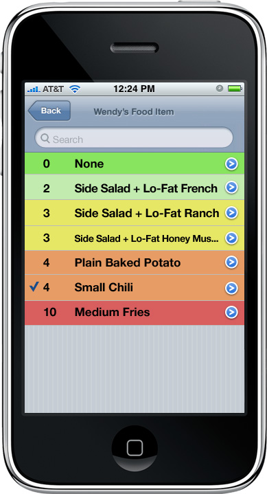
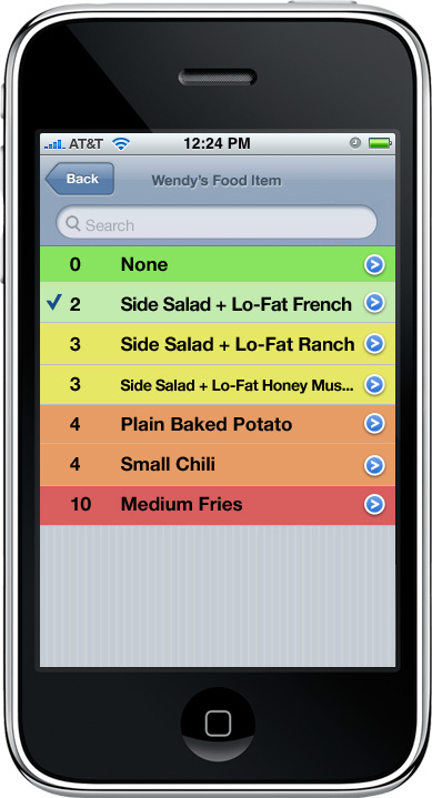
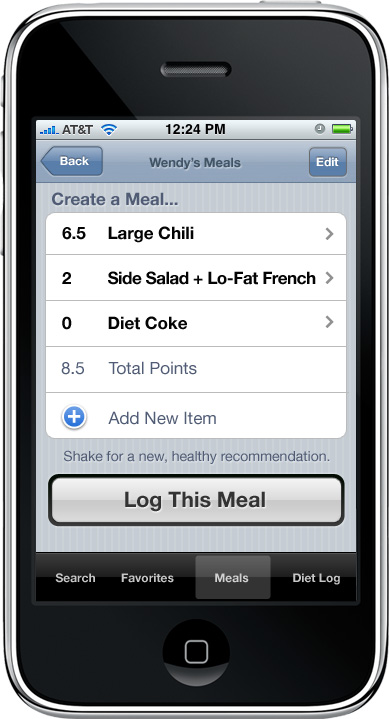
As a team, we proposed an iPhone application that would help Weight Watchers members stick to their weight loss plan no matter where they are. We aimed to help our users make good, healthy choices when they are at their most vulnerable, and when they are most likely to give into temptation: when they are eating out. We realized that with the iPhone we would be able able to provide this information in context, such as when the user is waiting in line at a fast food restaurant, and that we could free them from the effort normally required to plan a healthy meal choice.
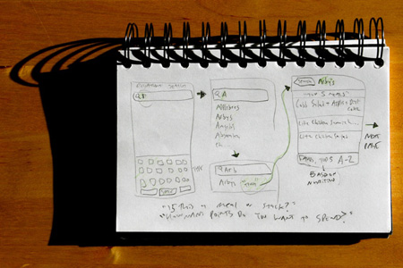
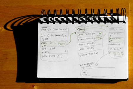
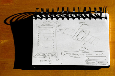
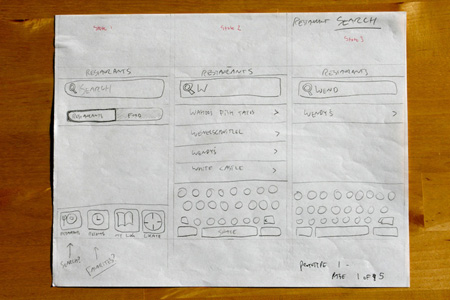
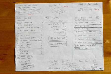
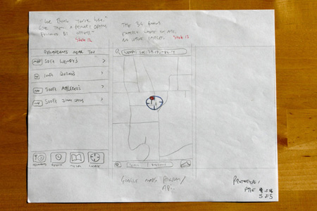
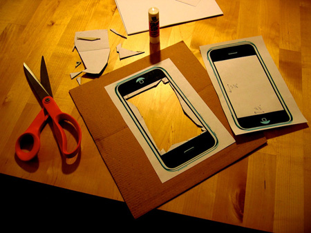
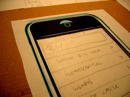
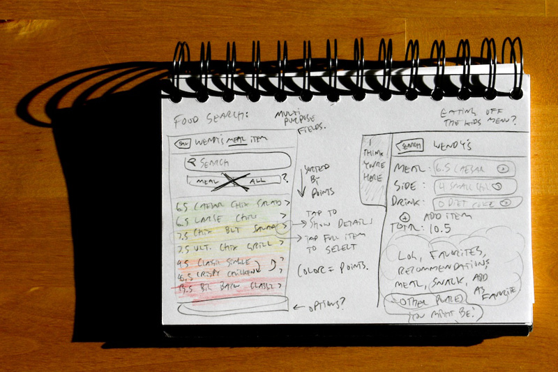
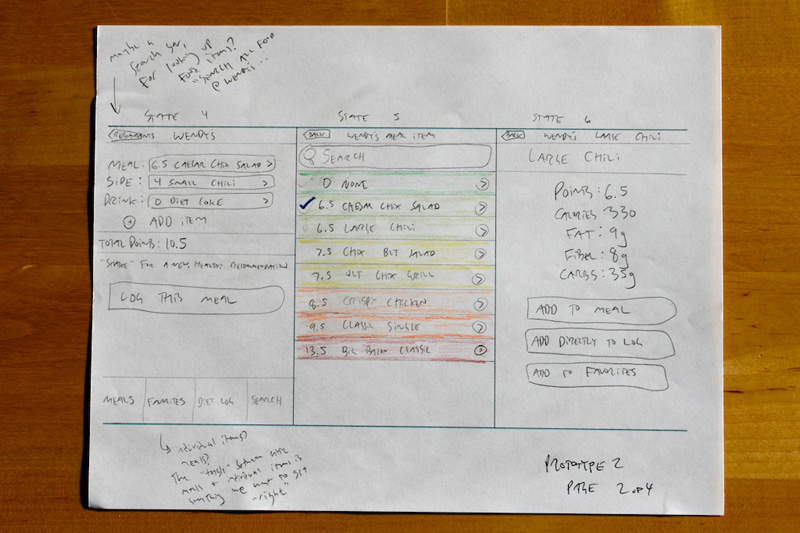
Based on our research at the Weight Watchers meeting, we created three personas that we felt would be pretty compelling Weight Watchers members. We began by sketching ideas, which eventually coalesced into a low-fidelity paper prototype of our application. We created a large cardboard cutout of an iPhone to simulate the device, and to only display one screen at a time and avoid overwhelming the user.
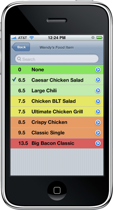
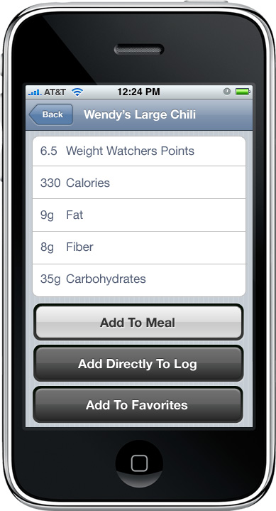
We conducted a series of formal usability studies with our paper prototype, iterating and refining the design after each test in response to user feedback. Finally, we created a series of high-fidelity Photoshop mockups that represented a common scenario, which we printed out to use with our screen for another round of usability testing.
