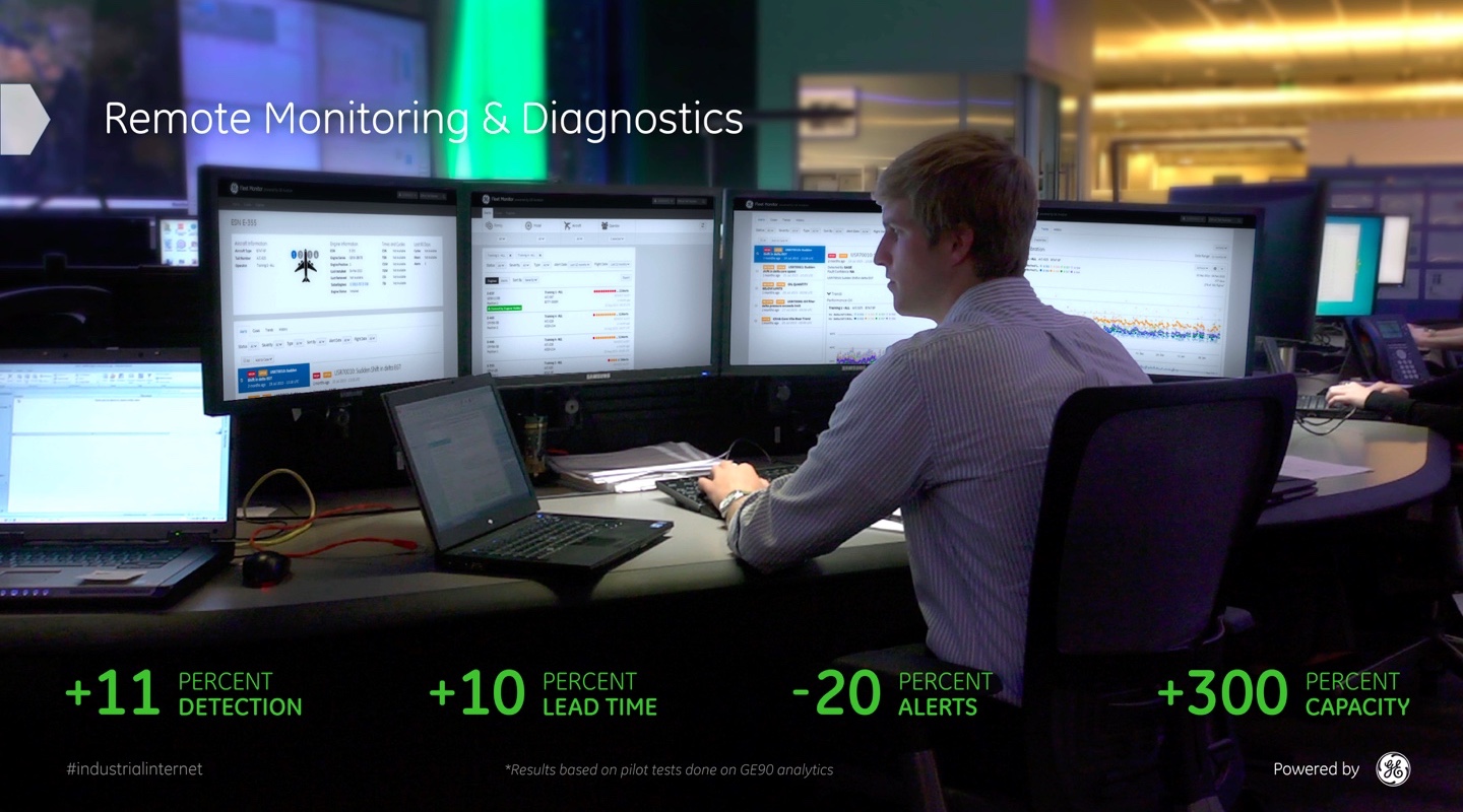
Fleet Monitor Remote Diagnostics Web App
I worked with Fleet Support to strategize, design, prototype and launch Fleet Monitor, an industrial-strength web app used to monitor more than 56,000 jet engines and 24,000 aircraft, 24 hours a day, 365 days a year.

The GE Aviation Fleet Support team is responsible for keeping an eye on every single GE jet engine in flight across the globe. I worked with them to modernize the remote monitoring and diagnostics platform they use for analyzing flight data, designing a new web application that enables front-line users to more efficiently and more accurately handle incoming alert messages.
Redefining diagnostics in the aviation space.

Every time a plane with GE engines takes off and lands, Fleet Support receives and analyzes detailed diagnostic data in order to detect any potential performance anomalies. If an issue is suspected, an analytic generates an alert that is reviewed by an experienced front-line technician, who takes an in-depth look at the assets in question in order to determine the next course of action.
Fleet Monitor represented the first major overhaul of Fleet Support’s alert management workflow in more than a decade. Rather than simply re-skin the ancient interface, we took this opportunity to rethink the design of the application from the start.
As the design lead on this critical initiative, I put together a user research plan, conducted user and stakeholder interviews, and worked closely with my design team to synthesize our findings.
Focus on assets, focus on collaboration.
Our goal with the new application design was to improve efficiency and accuracy for front-line monitors who are responsible for reviewing incoming alert messages. We achieved this by centering the Fleet Monitor design around three key concepts:
- An asset-centric workflow, which allows users to review and manage all the alert messages for a single asset at a time.
- An asset profile view that summarizes all the relevant information for an asset, giving the user deeper situational awareness as to the asset’s history, current operational status, and other important contextual details.
- Collaboration and case management capabilities that allow users to track a case on an asset over time, consolidating all relevant data, observations and comments into a single view that is accessible by all teammates.
The decades-old interface we were replacing lacked all of these capabilities, and each one represented a change for the Fleet Support organization in terms of process, training, key performance indicators, and even how they communicate with airlines. It was my responsibility to evangelize our proposed design strategy to numerous groups and individuals, including members of Fleet Support leadership, and I developed quite the road show to take around and help get everyone on board.
Making it real, and more real, with prototypes.
With buy-in from all levels of the organization for us to realize the design vision of Fleet Monitor, I shifted gears and started building a prototype to communicate the basic structure of the application. Through multiple rounds of feedback with users and stakeholders, what started as a clickable site map grew into a site architecture, and soon into a prototype that showed in painstaking detail how existing mental models and workflows at Fleet Support would be represented in the new application.
In the end, the prototype served as the source of truth for nearly all workflow patterns and design decisions related to Fleet Monitor. Hosted internally, everyone from product owners to software engineers referred to it on a daily basis. The prototype was the watering hole for our wider team, and it was instrumental in keeping everyone, including our vast network of stakeholders, on the same page.
Angular wrangler.

I built the Fleet Monitor prototype using Angular, Bootstrap and GE Digital’s IIDS design system, the same technologies used by my front-end engineering team. As we moved into the development phase of the project, the high interactive fidelity of the prototype meant that we already had a good idea for how interactions and workflows would feel in the application itself, so we were able to hustle quickly from design to code. Much of my HTML and Sass from the prototype was implemented as-is in the application, and in many cases my Angular directives offered a better “pseudo-code” description of a component’s desired behavior than any handcrafted agile story.
Likewise, my front-end engineers would often come up with more elegant solutions than I had originally envisioned in the prototype, especially when it came to handling edge cases and corner cases. Since we were all working with similar code we could rapidly riff off each other’s ideas, eventually arriving at an ideal design solution that, by the nature of our collaboration, was already baked into the application.
Launched for GE Aviation and all their customers.
After a long and careful internal pilot with GE Aviation users, we deployed Fleet Monitor into production in September 2015, making the tool available to users at hundreds of airlines so they can use it to monitor their own fleets of assets.
How much of an improvement does Fleet Monitor offer over the old tool? Don’t take my word for it. GE Aviation Fleet Support describes Fleet Monitor as providing “the industry’s most innovative and advanced engine monitoring and diagnostics.” Shucks!
Still curious? The GE Aviation blog has more about the analytics platform that powers Fleet Monitor.
Project Responsibilities
Design Research, Research Synthesis, Design Strategy, Wireframing, Prototyping, Development
Project Technologies
HTML, CSS, JavaScript, Angular, Sass, Gulp
Project Team
Vivek Bansal
Jody Bialowas
Jennifer Cooper
Steve Curd
Bill DeRouchey
Zeeshan Mirza
Ravi Navamany
Mateusz Nowosielski
Dane Petersen
Eugene Valdez
Joe Voegtle
Project Timeline
April 2013 – September 2015