“See Akzidenz First!” Type Specimen Book
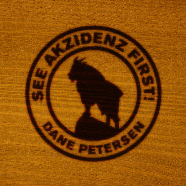
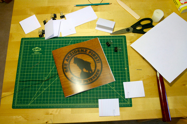
Inspired by the turn-of-the-century American railway lodges of the Glacier National Park region, I designed, printed and bound a type specimen book for the Akzidenz-Grotesk type family. The design of this book explores the confluence of traditional European luxury, and the rugged natural beauty of the western United States.
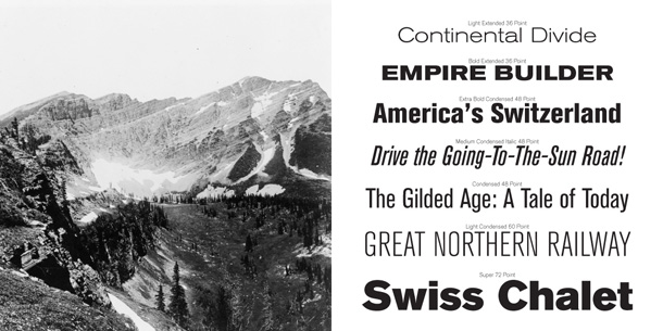
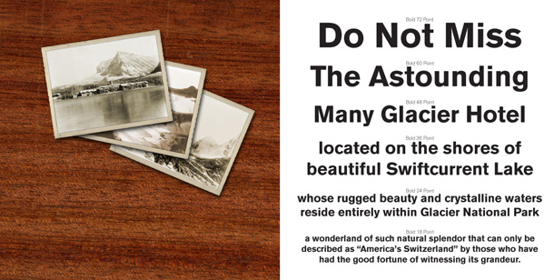
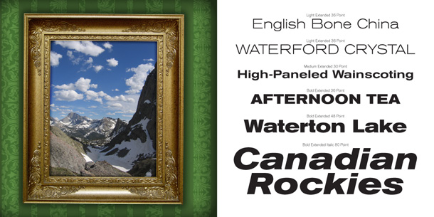
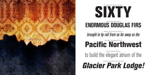
Akzidenz-Grotesk is an early sans-serif typeface released in 1896 by the H. Berthold AG type foundry in Berlin. It pre-dates Adrian Frutiger’s Univers and Max Meidinger’s Neue Haas Grotesk, released under the familiar name Helvetica, by more than 60 years.
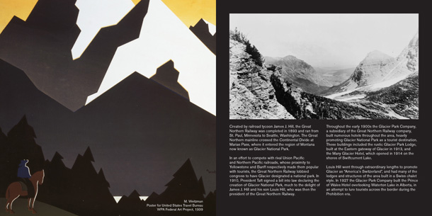
For the design of this specimen book, I focused on the railway hotels of the Glacier National Park area, which were built by the Great Northern Railway company in the early 20th century to compete with rival railways for tourism. Louis Hill, the son of railway baron James J. Hill, went through extraordinary lengths to promote Glacier as “America’s Switzerland” and “The Alps of America.” Obsessive and controlling, Hill demanded that the hotels and lodges of the area be built in a Swiss chalet style.
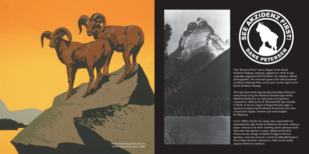
“See America First!” was a slogan of the Great Northern Railway, suggested by the railway’s official photographer Fred Kiser and adopted by the company in 1906. The mountain goat is the official symbol of Glacier National Park, and is featured on the Great Northern logo.
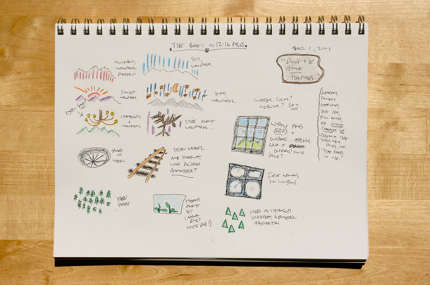
Designing this specimen book blossomed into a significant research project, to establish an accurate and believable visual language. I mined the Library of Congress for historic photos of the Glacier region, turn-of-the-century railway advertisements, and WPA posters created during the Great Depression to encourage American tourism.
