Adaptive Path Home Page
While working as an experience design intern at Adaptive Path, I dared to rewrite some of Douglas Bowman’s own code and implemented a newly designed home page.
Adaptive Path designed their new home page internally, and entrusted me with bringing it into the world as a fully-functional web page. The new layout freshens things up with a clean and elegant hierarchy, including a series of modules that share the most recent essays and blog posts published by the company’s wonderfully creative team. I created these modules to be completely self-sufficient and maintenance free, automatically pulling in new content from Adaptive Path’s content management system as soon as it is published.
Additionally, I wrote a series of scripts that hit up the Adaptive Path Twitter feed and pull down their most recent tweets. There are many JavaScript solutions for low-volume sites that perform a similar function, but the high traffic generated by the Adaptive Path website demanded a more robust approach. I developed a lightweight caching module that wraps around their call to the Twitter API, keeping their tweets fresh without hitting Twitter on every page load.
Designing for designers.
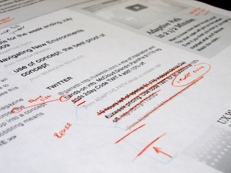
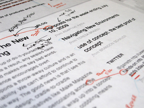
Designing for a team of designers requires a detailed eye, and a sophisticated grasp of subtle typographic techniques. From single-pixel padding adjustments to hand-kerned image text, I labored over even the most minute of details to make the new home page shine.
Emil Ruder would be proud.
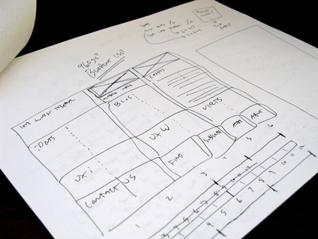
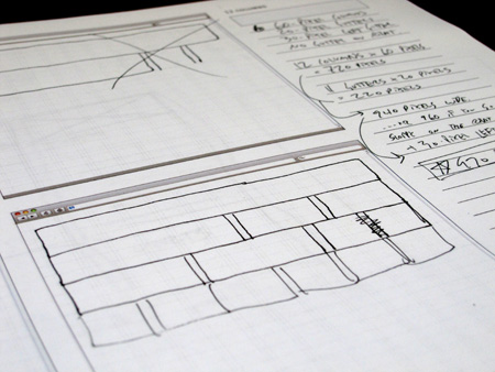
I locked the design to a pixel-perfect horizontal grid using the 960.gs CSS framework. Even at this level of precision, many of the most basic layout questions are still best answered with pen and paper.


